Southern Energy Management

Style Guides & Assets

Google Templates

Email Signature for Gmail Users Only

example of an approved email signature

Use the template that has the large banner with the mountains on it. Make sure you select your email platform at the top and work through the sections by inserting the information on the right. 

Company Data

  • Website – southern-energy.com
  • Address 1 – Put all of SEM’s address on one line: 5908 Triangle Dr., Raleigh NC 27617

Graphics

Disclaimer Text

  • Just delete all of it

Style

  • First font color – 9aa800
  • Leave the other colors as is

Social Media Links

  • Facebook – https://www.facebook.com/southernenergymanagement
  • Linkedin – https://www.linkedin.com/company/southern-energy-management/
  • Instagram – https://www.instagram.com/southern_energy/
  • Youtube – https://www.youtube.com/channel/UCgHFvpo3kP2jNaPlfSWbClw 
  • * Delete Twitter and Google+

Email Signature for Hubspot + Gmail Users

Use template #1 and use the information to the right to help fill out each section.

Select a Template
Turn off the slider button for created with Hubspot

Choose Template #1


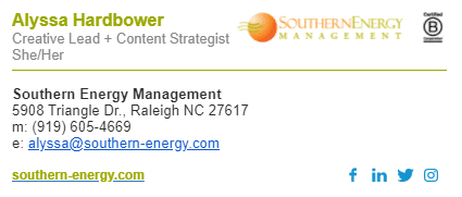
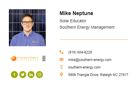
Signature Details (Tab #2 with the A)
Leave the department name and office number blank 

Website – southern-energy.com
Address 1 – Put all of SEM’s address on one line
5908 Triangle Dr., Raleigh NC 27617


Linkedin – https://www.linkedin.com/company/southern-energy-management/

Facebook – https://www.facebook.com/southernenergymanagement
Twitter – https://twitter.com/Southern_Energy

Instagram – https://www.instagram.com/southern_energy/


Leave the custom field stuff blank.


Style (Tab #3 with the paintbrush) 

Theme Color: F79426

Text Color: 000000

Link Color: 9AA800

Font: Arial

Font Size: leave on medium


Pictures (Tab #4 with the photos) 

Profile Picture: Ask Alyssa! (email alyssa@southern-energy.com)
 
You can leave everything else blank. 
 
Uploading your email signature
When you’re done filling everything out, click the navy blue button “create signature”. It will bring you to a new screen, you might need to fill out some basic info like company size and if you offer any marketing services. Fill it out, submit.
After that, click the button “copy signature”. You should be able to open Gmail > settings> scroll down to email signature > paste>save!
 

Logos

SEM’s logo is a combination of wordmark and abstract icon. The main lettering is a traditional serif font that establishes SEM’s position as a time tested leader in the solar industry and building performance space. SEM’s mark is an abstract representation of a sun with intersecting arrows symbolizing energy efficiency and solar. This is the main logo that will be used across all of SEM’s brand applications.

Primary Logo - No Tagline

The primary logo without tagline should be used whenever possible. The vertical logo without tagline should not be sized below 0.75″ high. The horizontal logo without tagline should not be sized below 2″ wide.

Secondary Logo - With Tagline

The secondary logo without tagline should be used in place of the primary logo when the tagline is necessary to communicate what the brand is about. The vertical logo without tagline should not be sized below 1” high. The horizontal logo without tagline should not be sized below 0.5” high.

Supplemental Logos

Supplemental logos should be limited in use, and used only when the primary and secondary logos do not meet the defined minimum height requirements. The wordmark may be used without the primary icon mark when size is less than 0.75” tall in vertical applications or 2” wide in horizontal applications. The wordmark may also be used on its own when printed on a material that prohibits clear legibility of the full primary or secondary logo.The icon mark may be used as a standalone element when size prohibits the primary or secondary icon to be used. It may also be used as a design element in limited applications like on business cards and vehicle wraps.

Brand Colors

This color palette should always be used in SEM’s print and online publishing. Color is an important part of SEM’s visual identity, and is used to establish and organize our three main lines of business. When referring to SEM as a whole, Sunrise Orange and Efficiency Green should be used as the primary colors. Air Barrier Blue should be used as a secondary color while all other colors should be used sparingly. Below are the color associations by channel. These color pairings should always be used in channel specific collateral and in digital design, both internally and externally.

Primary and Secondary Colors by Channel

Solar

BES

MES

MKTG / CORE

GUIDANCE

Primary Colors

Sunrise Orange

C0 / M55 / Y95 / K5

#F79426

PANTONE 144C

Efficiency Green

C45 / M20 / Y100 / K0

#9AA800

PANTONE 384C

Air Barrier Blue*

C85 / M55 / Y0 / K0

#236AAB

PANTONE 285C

Sun Burnt Orange*

C24 / M72 / Y100 / K15

#AE5800

Going Green*

C60 / M34 / Y100 / K15

#6D7E00

Seek Solutions Teal*

C87 / M38 / Y42 / K9

#007885

* These colors are accessible for use in headings and as a background color with white text

Accent Colors

Solstice Orange

C5 / M75 / Y95 / K0

#E85D22

Kilowatt Yellow

C20 / M30 / Y100 / K0

#D3B002

LTO Teal

C80 / M15 / Y30 / K0

#0DA0AD

Purpa Purple

C65 / M80 / Y10 / K0

#734F94

Blower Door Red

C15 / M85 / Y100 / K10

#CC4722

PV Purple

C35 / M70 / Y15 / K0

#9B4D89

Module Magenta

C25 / M100 / K70 / K5

C10745

Graph Paper Grey

C40 / M30 / Y30 / K0

#A5A5A5

Sheet Rock Grey

C55 / M45 / Y45 / K10

#7A7A7A

Slab Silver

C15 / M5 / Y5 / K0

#EFF3F6

White

C0 / M0 / Y0 / K0

#FFFFFF

Black

C0 / M0 / Y0 / K100

#000000

Fonts

The established typography guidelines should be followed when producing all externally branded documents. When the defined typefaces are not available, the alternate typefaces should be used. Consistent use of typography helps to maintain SEM’s brand strategy while creating a unified, professional appearance.

Lead the Change.

Heading - Roboto Black

Using business as a force for good.

Subheading - Roboto Black (but smaller)

Icons

These icons should be used in print and on the web to represent SEM’s lines of businesses and service offerings. New icons that are not currently in the icon library should be consistent to the rounded line style that has been established. Always maintain the same line weight when mixing icons from differing sets. On the web, Font Awesome icons are also acceptable to use.

Business Channel Icons

HES

CES

BES

MES

Icon Library

High-Performance Icons

Comfort

Savings

Sustainability

Efficiency

Photo Treatment

Bright, colorful, vibrant, and high quality photographs should always be used in SEM’s brand communications. Saturated, high contrast photos that err on the warm side are preferred. In-house photos should always be first choice whenever possible. Stock images should only be used in instances where a high quality photo of the desired subject is not available in SEM’s photo library.

Graphic Elements

All graphic elements should convey SEM’s brand voice and vision as fun and funky sustainability experts on a mission to lead the change. SEM’s graphic style is clean and bold, always favoring organization and legibility. Whitespace should be utilized as a design element, while overcrowding minimized and avoided. Color usage should be the primary structure of the design, accented by icons, photographs, and graphic elements. When considering a style for graphic elements, line drawings / icons, hand-drawn calligraphy, subtle gradients, and in-house photographs are preferred. Do not use clip art and stock imagery that does not reflect this style.